Welcome to Shelter Journal, a newsletter about practicing architecture in Aspen. Posts are about once a month and topics cover the local design, architecture, and development scene. I bring my personal experience running an architecture studio and working on development in our mountain communities to you with Shelter Journal.
Today’s post is about using images as precedents in design discussions:
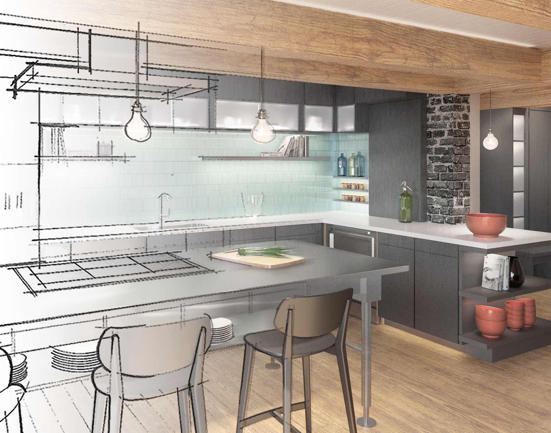
I’ve been thinking lately about how I communicate with my clients. In seeking to deeply understand their needs and to communicate our vision for the project, I use precedent images during design discussions so that I can “show not tell.” People really resonate with this technique. Yet, although helpful, I realize this tool poses a problem because it’s so hard to pull our eyes away from a finished project depicted in the inspiration photo to the unknown building we are designing toward.
We use online imagery in order to, literally, get on the same “page.” We will sometimes share a Pinterest or Houzz page, and in doing so, we have unconsciously infused online shopping into the design process. And because those sites are heavily algorhythmic, we see more of what we are used to. Where’s the magic in that? Algorithms decide what we see for shopping, streaming music, and streaming TV, and I have had enough of algorithms doing my thinking for me.
Thoughtful imagery can express intent and illuminate the road ahead in helpful ways. Many times, a picture can communicate an idea better than words, so precedent images will always have a place in my process. What I won’t do is use the internet as a design rolodex. If that sounds obvious to you, it’s not. Culturally we are so used to images/images/images that their impacts are sometimes overlooked and we rarely have conversations without them. But we cannot let an image intended to inspire instead stymie the artistic process—because that’s where the magic lies. We must not shortchange ourselves the creative spark-and-ignite opportunity of your ideas and mine, pencil to paper, inspiration and revision. A good rule of thumb: the image follows, not leads.


